


Context
Alkaline for Life is a supplement brand operating in a highly skeptical, misinformation-heavy category.
The Alkalini-C product page relied heavily on basic claims and product imagery, but lacked structured clarity around ingredient differentiation, buffered formulation benefits, and value justification.
The challenge wasn’t visual polish.
It was decision clarity.
Supplement shoppers faced three primary sources of friction:
Trust Skepticism
Customers questioned purity, third-party testing, and ingredient transparency.
Ingredient & Absorption Confusion
“Buffered,” “fully reduced,” or “triple-purified” created cognitive overload rather than clarity.
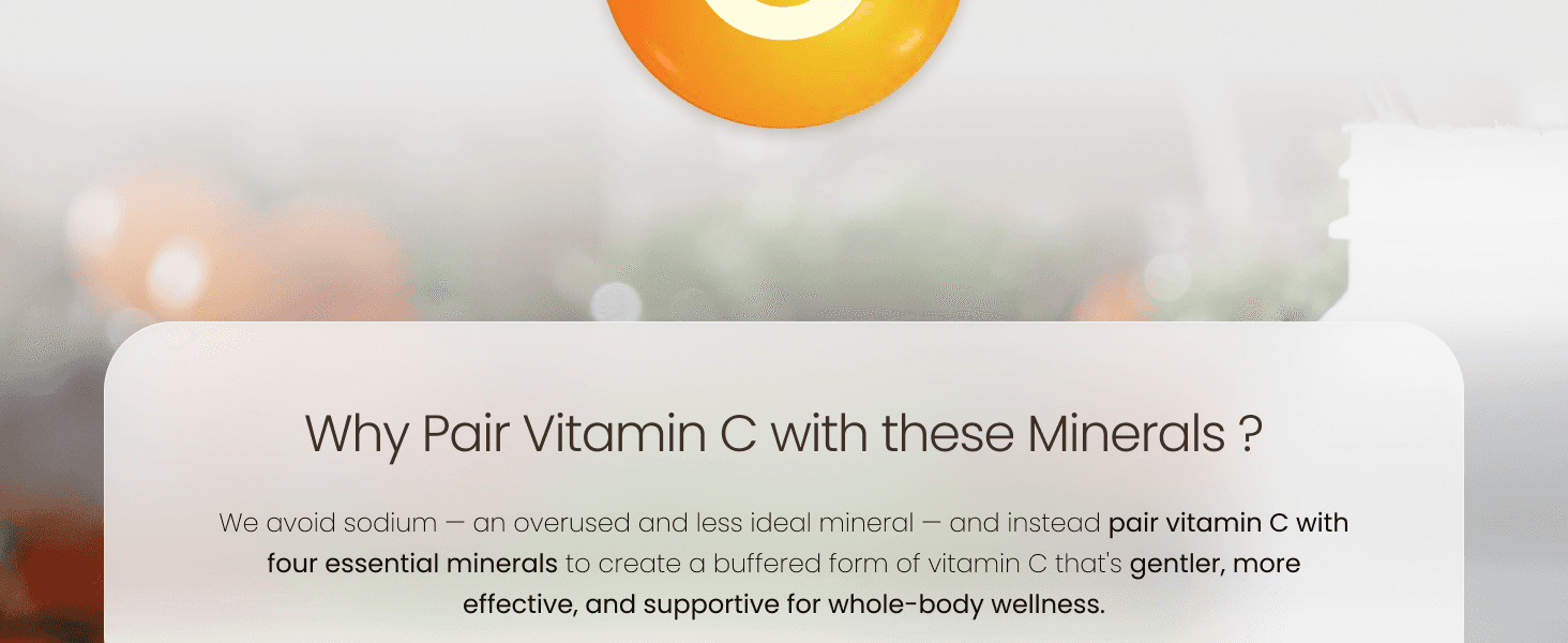
Value Ambiguity & Differentiation
Internal/external benefits of mineral buffers, as well as ease of digestion, were not clearly differentiated.
Problem Statement
How might we design a static Amazon experience that systematically reduces skepticism, confusion, and comparison anxiety, without control over the platform UI?
Research Approach
Because Amazon PDPs offer limited behavioral analytics and experimentation tools, I combined qualitative and competitive research to understand how supplement shoppers evaluate products in high-skepticism categories.
Research sources included:
• Amazon review mining
• FAQ clustering from customer questions
• Competitive PDP analysis across Vitamin C and supplement brands
• Forum and Reddit discussion analysis (biohacking / supplement communities)
The goal was to identify what information buyers look for before committing to purchase, and where uncertainty emerges.
Insight 01
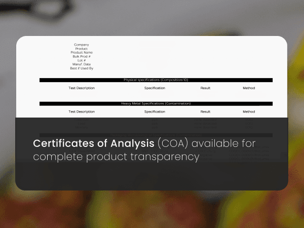
Transparency drives more trust than claims.
Shoppers consistently scrutinized ingredient sources, formulation details, and testing practices before purchasing. Pages that surfaced clear ingredient information early reduced skepticism faster than those emphasizing health claims.
Design implication:
Surface supplement facts and formulation transparency earlier in the decision flow.
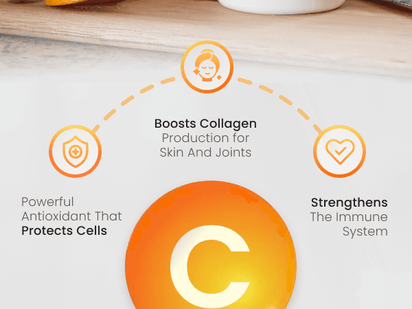
Insight 02
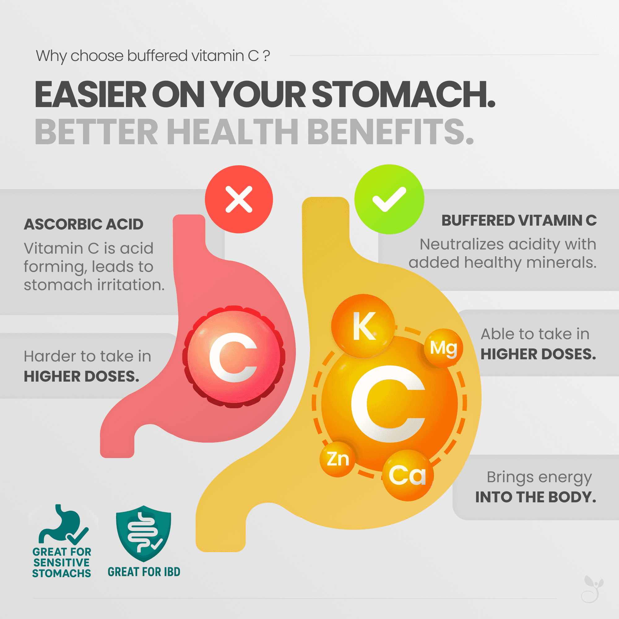
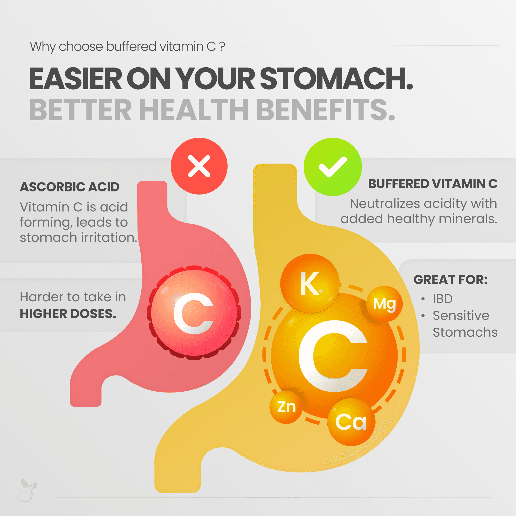
Digestive comfort is a hidden but powerful purchase driver.
Review mining revealed that many customers prioritize stomach tolerance and even referenced conditions like IBD as reasons for selecting buffered Vitamin C. Despite this, competitor pages rarely addressed these concerns directly or helped these users recognize the product as a safer option.
Design implication:
Highlight digestive comfort and gentle formulation early to help sensitivity-driven users quickly identify product fit.
Insight 03
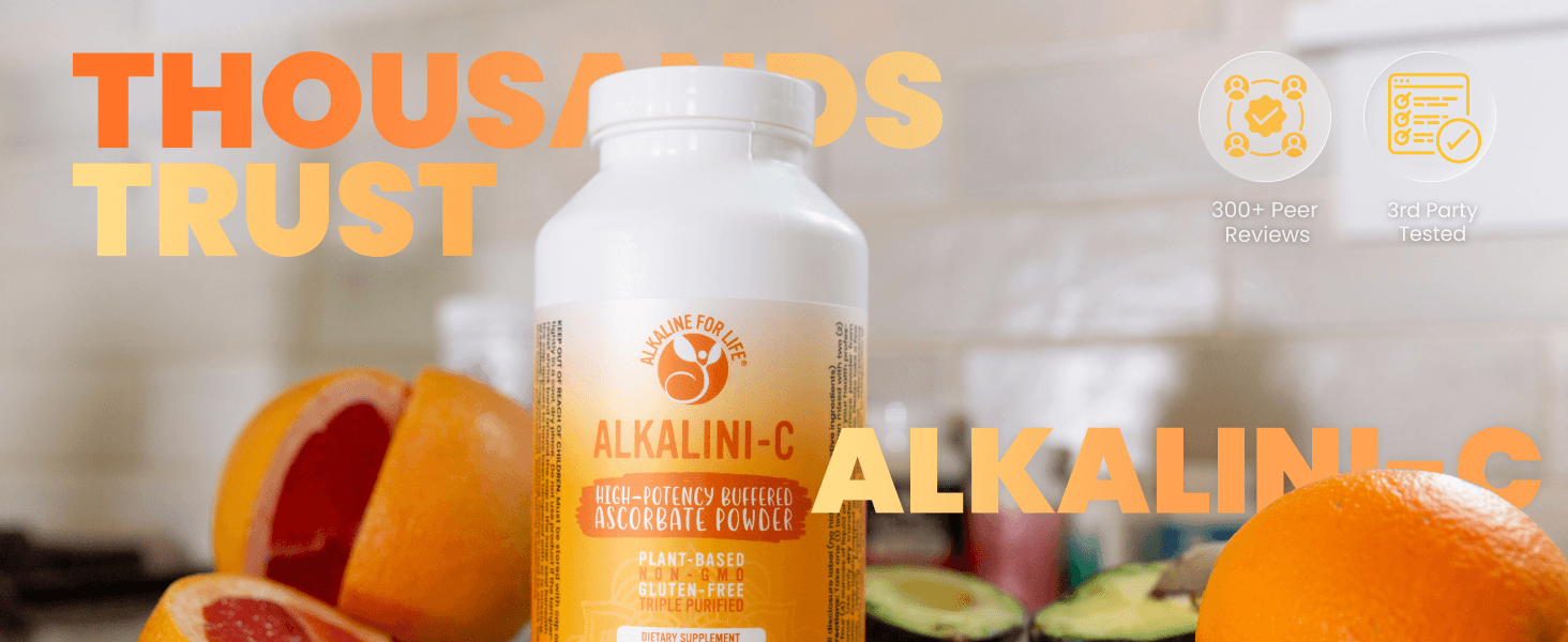
Trust is reinforced through expert credentials.
In a lightly regulated supplement industry, buyers look for signals that products are backed by credible expertise. Community discussions frequently referenced skepticism around supplement claims and emphasized trust in professional endorsements and curated expertise.
Design implication:
Highlight expert credibility by prominently featuring 'Formulated by Dr. Susan Brown', incorporating a founder quote, and introducing an 'About the Doctor' section within the content.
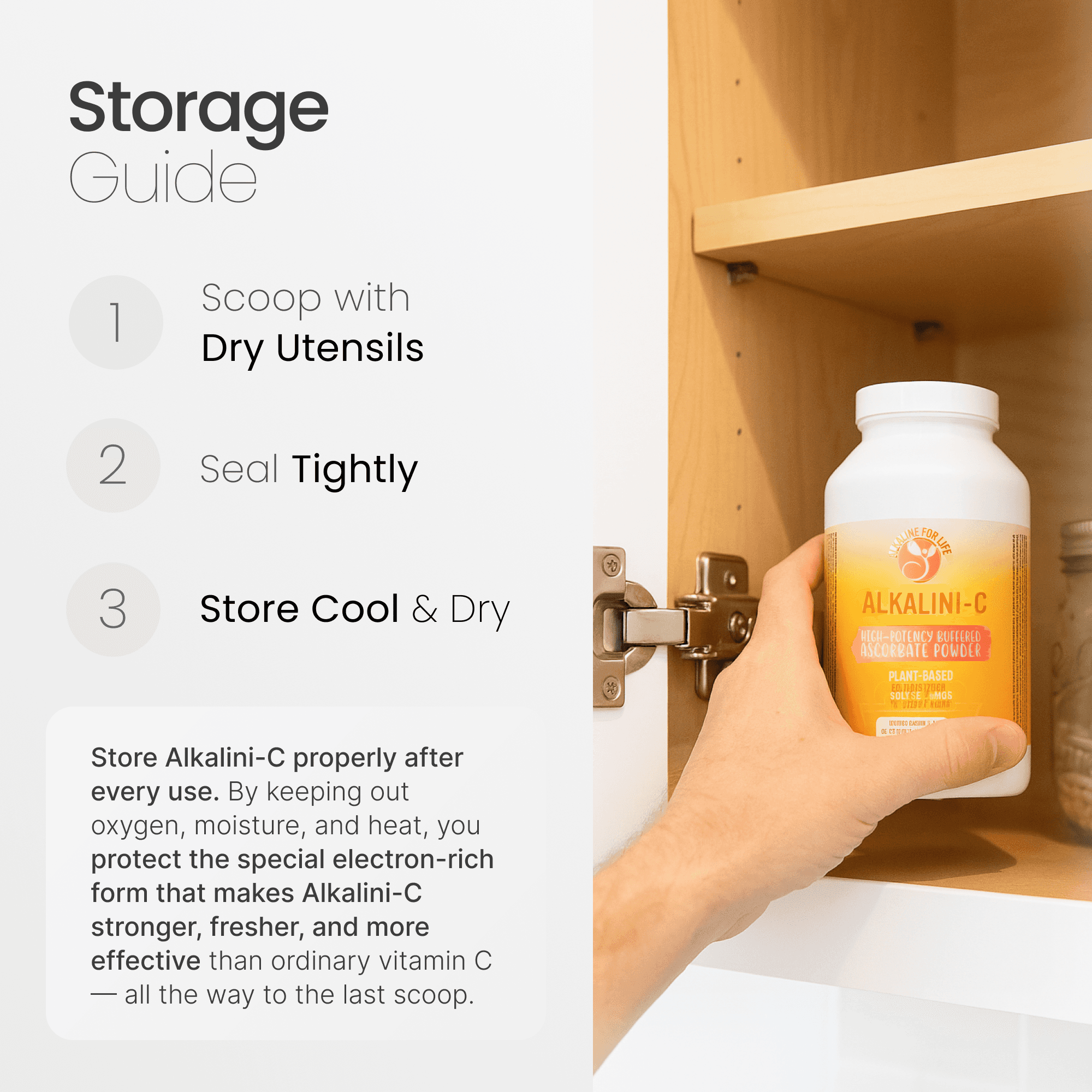
Insight 04
Preventable product issues erode trust if guidance is missing
Review analysis revealed that one of the most common complaints was the powder hardening inside the bottle before customers finished it. Many reviewers believed the product had “gone bad,” even though the issue was likely caused by moisture exposure and improper storage.
Design implication:
Introduce a 'Storage & Care' guide explaining proper handling, moisture prevention, and usage practices to reduce product misuse and protect customer satisfaction.
Design Thesis
To improve conversion in a high-skepticism category, the redesign must introduce missing trust signals and reorganized the product page around the questions customers actually ask, making formulation benefits, credibility, and usage guidance immediately clear.
I treated the Amazon carousel as a constrained onboarding flow:
Legitimacy (Hero)
Clarity
Differentiation
Value
Trust
Comparison
Reassurance
Credentials
Key Design Decisions
Problem
Skepticism around purity and formulation. Indescriptiveness of generic supplement facts labels. Explanations coming too late.
Strategy
Surface radical transparency immediately. Describe exactly what each ingredient is, why it’s included, and what the benefits are. Design for both the expert and the novice. Answer the two most frequently asked questions. Showcase it all simply.
Impact Hypothesis
Reduce early bounce from label-scanning shoppers and questioning newcomers.

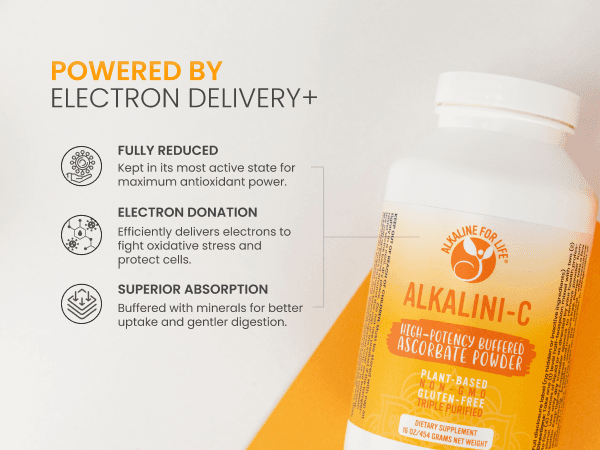
Problem
Most shoppers don’t understand what buffered Vitamin C is or how it differs from standard ascorbic acid. This confusion makes it difficult to recognize the product’s key advantage.
Strategy
Visualize the difference directly. Use a simple stomach comparison to show how buffered Vitamin C neutralizes acidity with mineral buffers. Highlight benefits for sensitive users.
Impact Hypothesis
Help shoppers quickly understand the product’s core differentiation while increasing confidence for customers with sensitive stomachs.
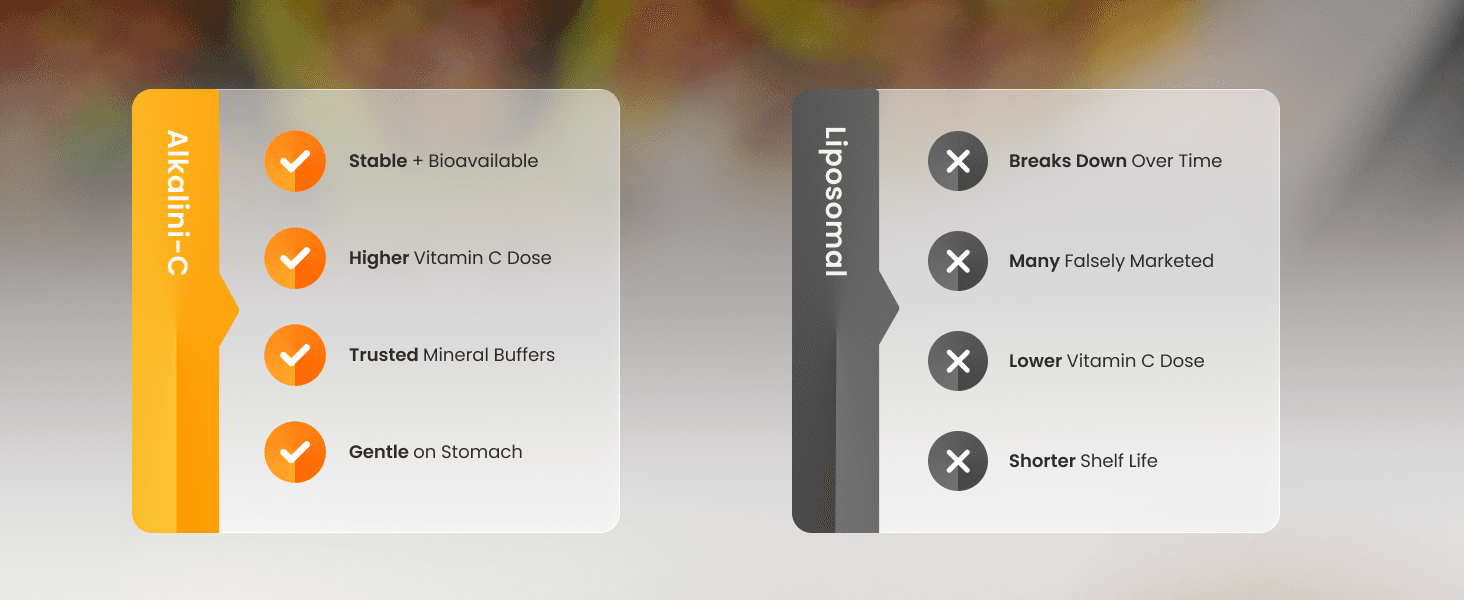
Problem
Supplement shoppers frequently compare multiple Vitamin C types and brands before purchasing. Without clear differentiation, it’s difficult to understand why one formulation is better than another.
Strategy
Present a clear side-by-side comparison that contrasts mineral-buffered Vitamin C with common alternatives. Highlight key differences in dosage, mineral buffers, and stability while visually dismantling common competitor advantages.
Impact Hypothesis
Help customers quickly rationalize the purchase by eliminating comparison uncertainty and reinforcing the product’s formulation advantages.

Problem
Customer reviews revealed a recurring complaint: the powder hardening in the container due to moisture exposure. This raised concerns for new shoppers about whether they might experience the same issue.
Strategy
Address the concern proactively with a simple, scannable storage guide, to show how the issue can be easily avoided. Answer the question, "Are the negative reviews just customer negligence?"
Impact Hypothesis
Reduce hesitation from review-conscious shoppers while protecting long-term customer satisfaction by preventing avoidable product misuse.
Performance
Turning More Visitors into Customers
After the redesigned product page launched in October 2025, the page began converting a higher percentage of visitors into customers while overall traffic remained similar. As conversion increased, revenue rose despite nearly identical session volume.
The Relationship
What This Suggests
Because traffic stayed roughly the same while conversion increased significantly, the performance lift likely came from improving the product page's ability to turn visitors into buyers, by helping reduce hesitation and improve purchase confidence.
Key Constraints
Static Content Only
Amazon product pages rely on a sequence of static images. Interactive elements such as tooltips, expandable sections, or guided flows were not possible.
Limited Layout Control
Content hierarchy could only be influenced through the ordering of carousel images and A+ modules, rather than through flexible UI components.
Minimal Analytics
Amazon Seller Central provides only high-level metrics (sessions, conversion rate, units ordered), limiting the ability to deeply analyze user behavior or identify specific drop-off points.
Design Tradeoffs
Carousel vs A+ Placement
Core decision drivers were prioritized in the carousel, while supporting content like brand story and lifestyle imagery moved to A+ to avoid competing for critical above-the-fold attention.
Education vs Scanability
Complex formulation details were simplified into visual explanations so shoppers could understand key differences quickly without reading dense text or being overwhelmed.
What I'd Improve Next
Start with Highest Impact Opportunity
After gaining access to analytics near the end of the project, I discovered that the brand’s Ionized Magnesium product receives ~44% of total page sessions, but converts at only ~1.26%.
Build a Repeatable Product Page System
Rather than designing each PDP independently, I would evolve the visual language into a repeatable design system that can scale across the brand’s supplement catalog.
Strengthen Visual Continuity Across All Slides
Future iterations would refine the graphics so each carousel slide feels like part of a cohesive system rather than standalone designs — reinforcing brand recognition and improving visual flow.
Improve Carousel Navigation Cues
Because Amazon’s carousel lacks explicit navigation, I would introduce stronger visual cues such as subtle progress indicators and directional prompts to guide users through the decision journey.
Reflection
This project reinforced how much clarity, trust, and information hierarchy matter in high-skepticism product categories, especially when working within constrained platforms like Amazon.
Appendix
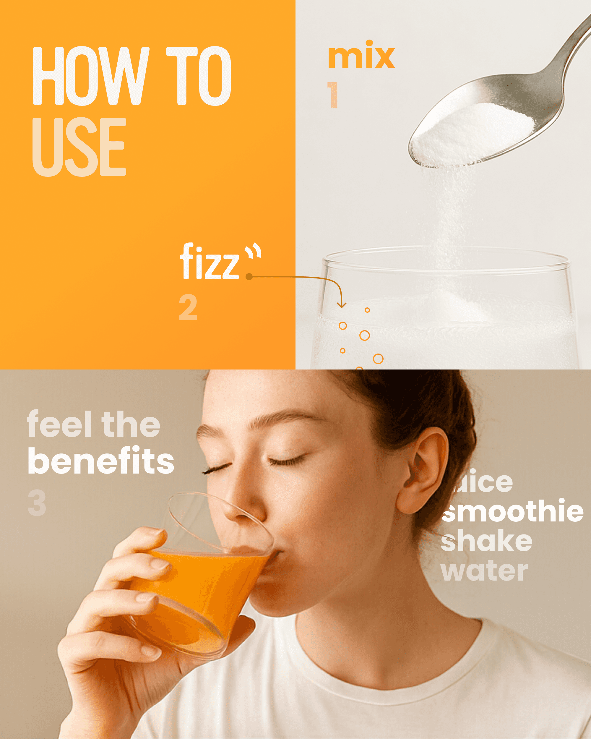
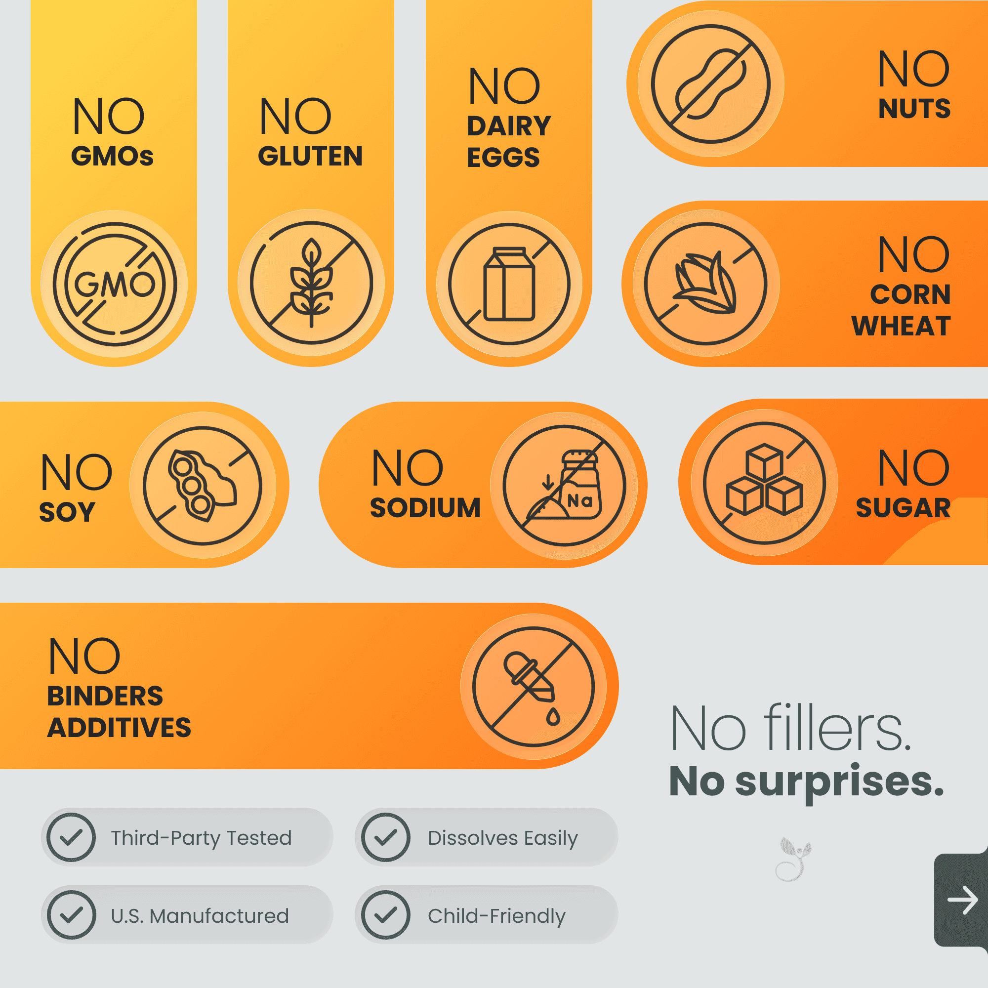
Below is the complete set of carousel graphics and A+ modules designed for the Alkalini-C product page, illustrating how the trust-building system extends across the entire PDP.

All
Cart
All
Rufus
Join Prime
Same-Day Delivery
Amazon Haul
Medical Care
Amazon Basics
Buy Again
Buy Again
Audible
Pet Supplies


$
45
50
Add to cart
Buy Now
Supporting modules placed further down the page reinforce trust signals, brand credibility, and product education without competing for primary carousel attention.


Other Content